Yudaimonia Mobile Concept
Digital Product Designer
UX/UI Designer
UX/UI Designer
Zayn Abed
Daniel Lionti
Daniel Lionti
June 2024 - September 2024
Figma/FigJam
Illustrator
Photoshop
Illustrator
Photoshop

Yudaimonia is a habit tracker that helps to promote healthy habits and happy living.
This project focuses on redesigning an existing web app to enhance its functionality and user experience on mobile devices.


Yudaimonia is a habit tracker aiming to help users create healthy habits by encouraging consistent behavior. The website lets users create habits with custom names, colors, units of measurement, and save them to their habit dashboard. My role was involved creating wireframes and layouts to help aid future app development.
“The happy life is thought to be one of excellence; now an excellent life requires exertion, and does not consist in amusement. If Eudaimonia, or happiness, is activity in accordance with excellence, it is reasonable that it should be in accordance with the highest excellence; and this will be that of the best thing in us.”
-Aristotle

My role involved creating wireframes for a proof of concept mobile version of Yudaimonia. I worked with some preliminary user testing data and research and consulted with Zayn throughout the design process. This is an ongoing project, my tasks will change to adapt to later stages of the project.
All perliminary user testers had complaints about Yudaimonia's mobile user experience. Yudaimonia was designed as a desktop application and clumsy to use when on mobile. Because Yudaimonia is still in development, and the mobile experience has not received the love that it desperately needs. There are many rough edges and design problems that the developer wanted me to look at before releasing Yudaimonia to the public.
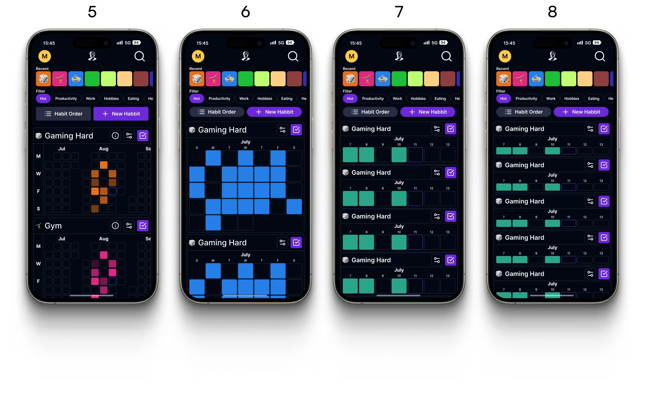
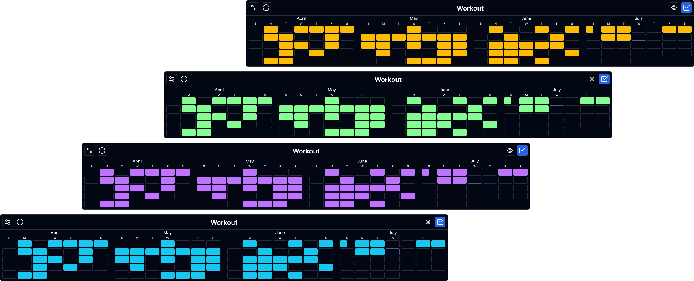
The image on the right shows the calendar widened. On a wider display like a tablet, this is what it would look like. This also helps illustrate how a user would be able to scroll through their calendar in the final app.


Here's the goal: we need to implement all of Yudaimonia’s current desktop features in a mobile format that is easy to use, while also remaining visually similar to the current website.


Yudaimonia already had a target user base of people who want to better themselves. The target users above are specifically for the mobile adaptation.


Keeping the current web experience in mind, I identified three key items that were important for Yudaimonia Mobile:
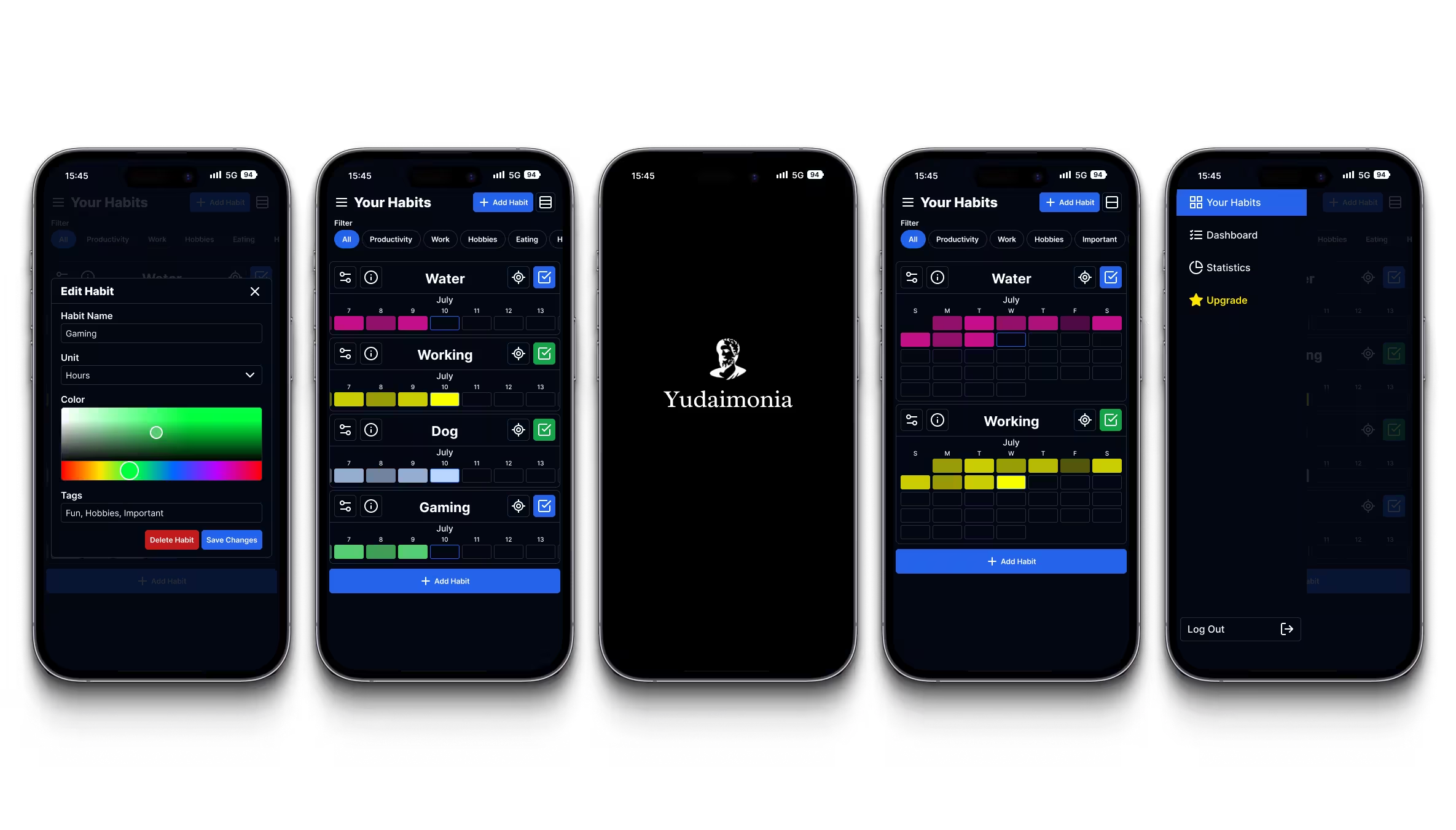
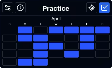
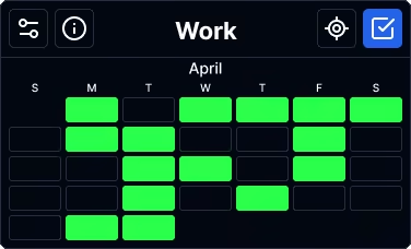
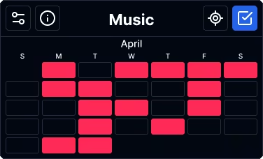
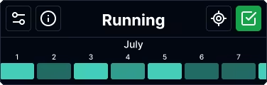
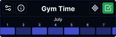
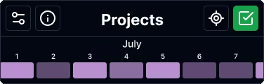
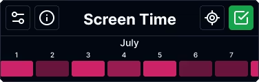
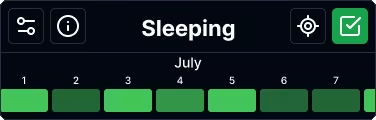
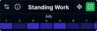
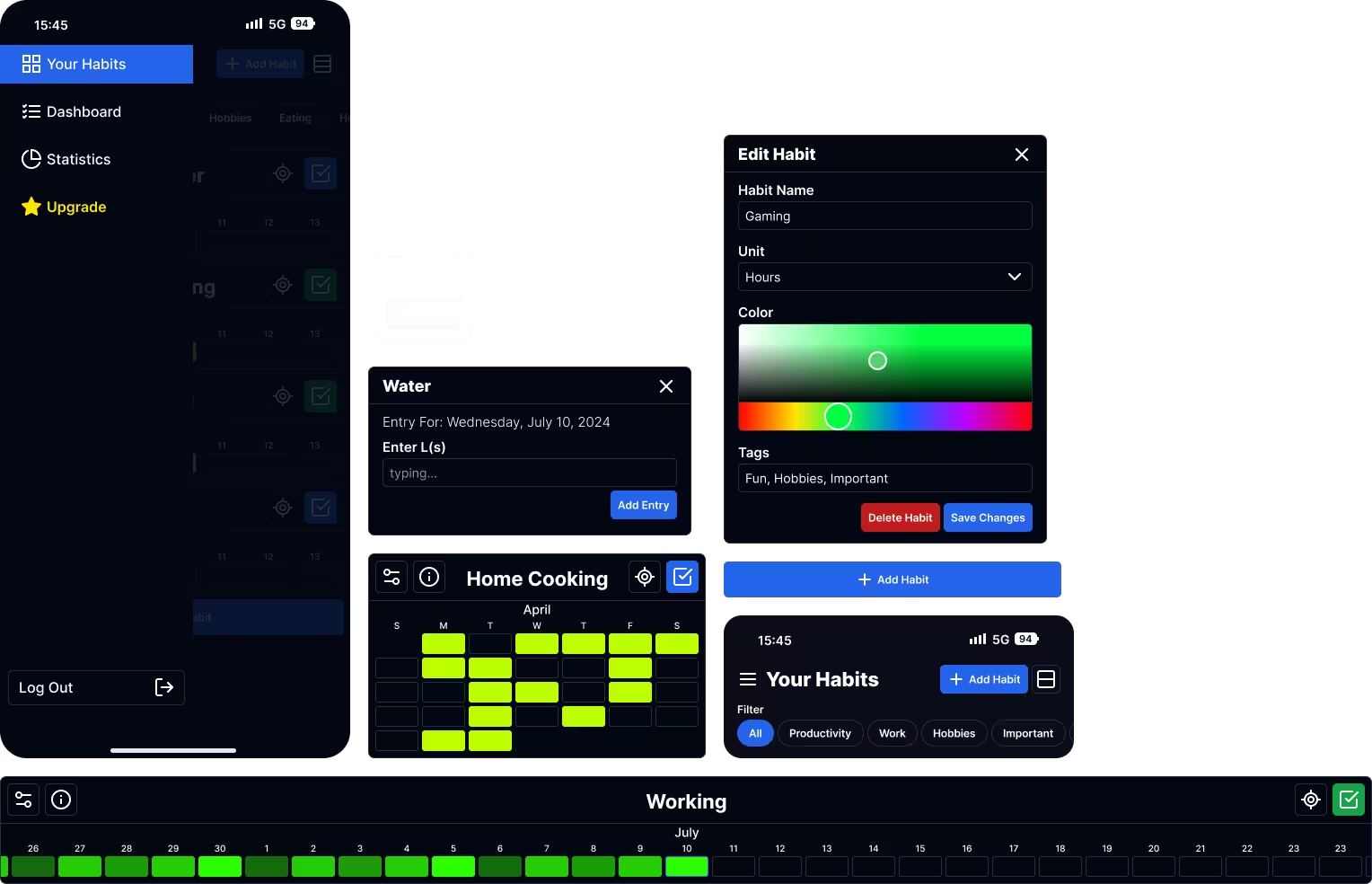
Yudaimonia needs a calendar system that works for mobile. User testing has shown that without an easily understandable calendar, the whole experience becomes a hassle. I designed a calendar with two modes. A compact view that prioritizes showing as many habits as possible, and an expanded view that prioritizes showing habit data.
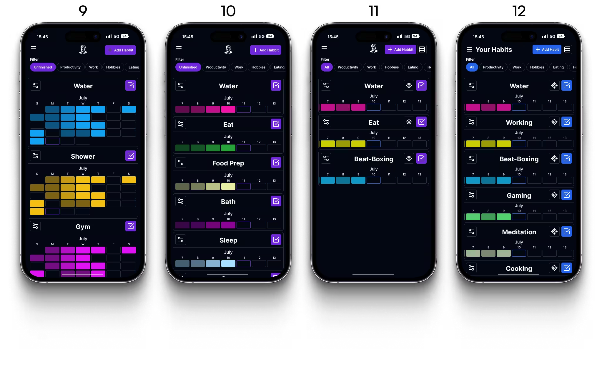
A way for users to easily sort, search for, add/remove, and customize tasks. This was done by adding habit tags and a sorting system. Customization settings were also all put into one simple menu, which removed buttons from the old design and helped free up some much needed space.
Maintain the design of the current experience and improving readability and information hierarchy where necessary. It was important that the current look and feel was maintained on mobile, while also making any necessary changes to improve readability and the overall user experience


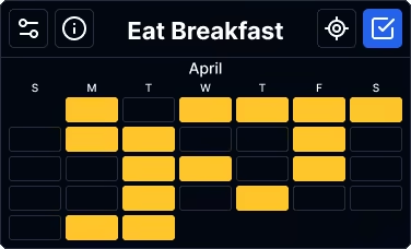


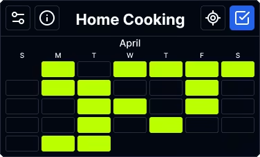
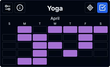

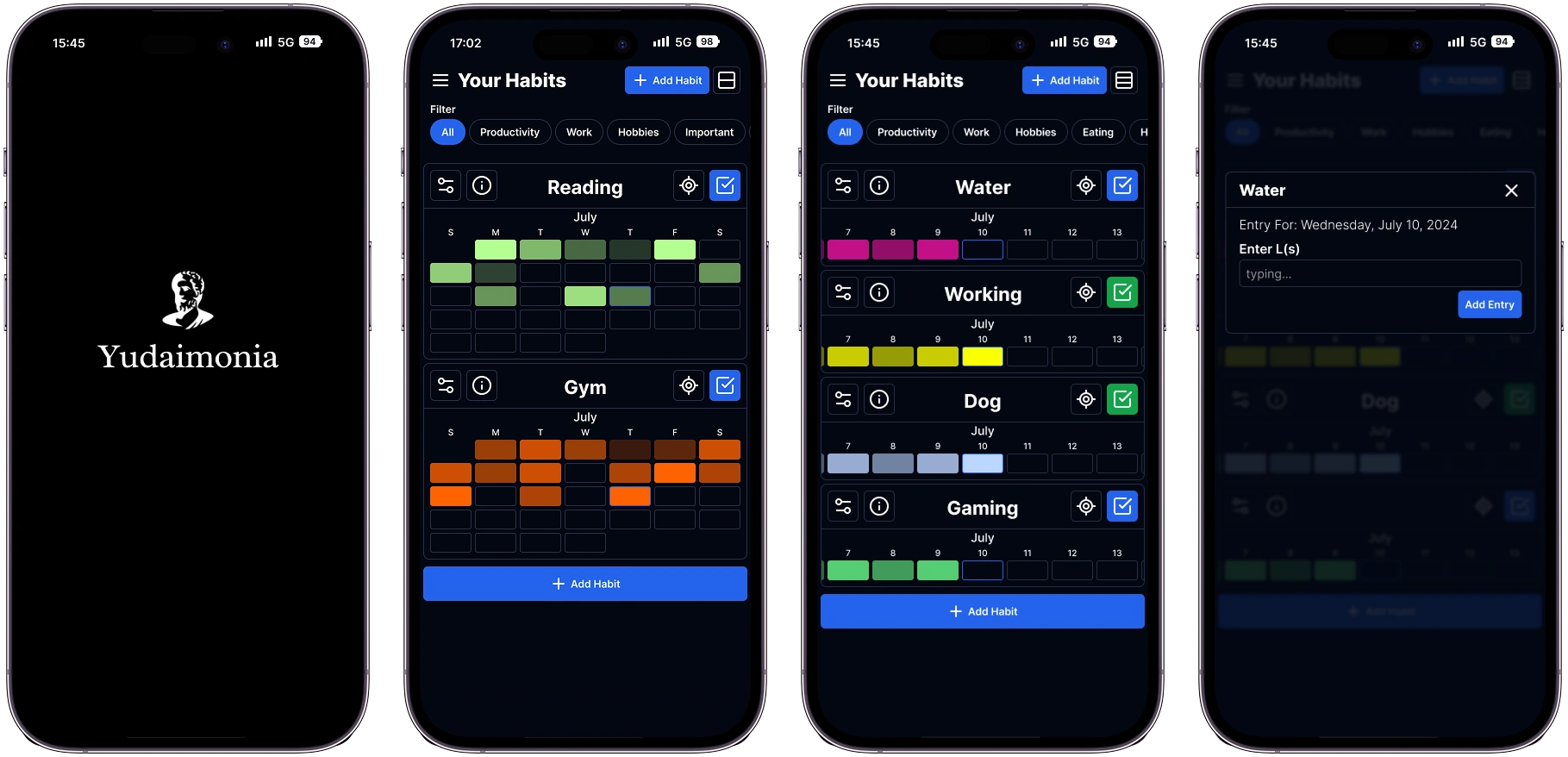
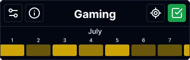
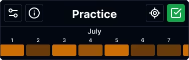
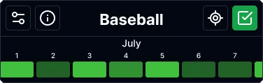
When a user wants to see as many of their habits on the screen as possible, they can go into compact view by pressing the button at the top right of the screen. This view is similar to the expanded view, but it only shows one week at a time, and the labels are by number instead of day of the week. That choice was made because without being able to see the other weeks as context, users wouldn’t know what day it is.
For users that want to quickly fill in a few different tasks, compact view would work best.


For users that have a lot of habits, there was no easy way for them to sort through them all quickly. For the new mobile design, I added a tagging and sorting feature to help solve this problem. Whenever a user creates or edits habit, they will be able to add as many tags as they want to that habit. Near the top of the dashboard, there is a row of pills that will allow the user to quickly sort by any of the tags they have created.
This new pill systems helps make sure that user's don't need to scroll through their entire dashboard to get to a habit that might be all the way at the bottom.
The options and filters at the top of the screen will stay at the top while the user goes through their habits, they will be in reach whenever the user needs those options.
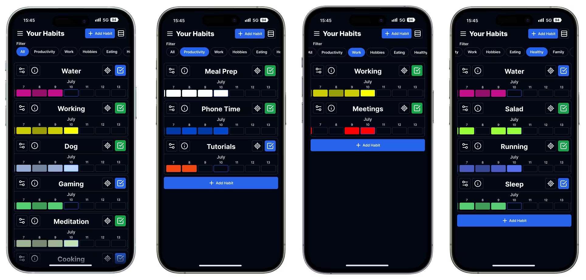
In order for users to seamlessly swap between using the app and the website, it was important for the new designs to look visually similar to the current experience. Some aspects, like color scheme, font choices, and iconography, were not changed from the website. The calendar redesign is the most notable change, but effort was taken to still maintain the general design.


Several new buttons were added in order to improve the functionality of the app. Habit information and data was added to it's own menu, changing the order of habits was added to the settings menu, and several other quality of life features were added, including a button that goes to the current date/week.
Additionally, the menu to fill in and complete an entry is also hidden behind a button. This can be accessed by pressing the check mark or the day you want to fill in.
The first step would be to get the app developed and released. Any new features can be developed once the app is out. After that, more research and user testing can be done to further refine the app.
There are many features that are currently being developed, and a premium set of features is in the works. I can't wait to see what comes next for Yudaimonia.
As with any project, there are always areas for improvement. It can be challenging to determine when to stop refining a project, but I'm satisfied with the outcome. There's always room for future enhancements.
The thing that stood out most to me during this project was how challenging it can be to bring certain aspects of a website to mobile. The calendar was particularly challenging because it had many small squares that worked perfectly fine on desktop, but if they were just brought to mobile as is, the whole user experience would be negatively impacted by all the tiny squares. The squares were impossible to tap with any accuracy and were way too small to understand. It took weeks to figure out a calendar format that we were happy with, and there is always room for more refinement.
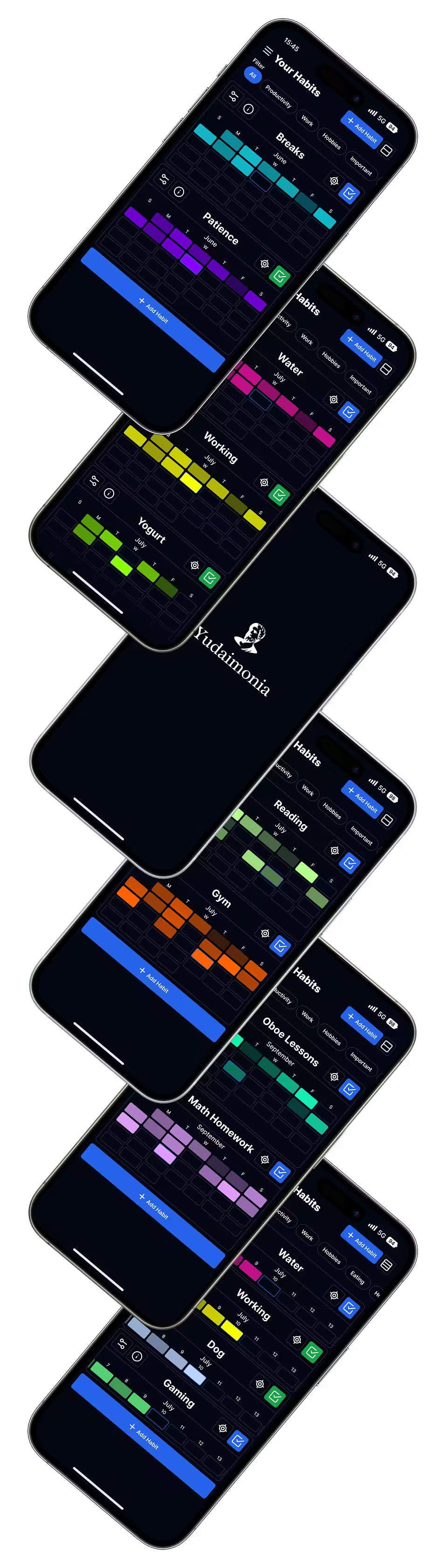
Here is a collection of mockups to help showcase the development and progress for Yudaimonia's mobile redesign.
As the most important part of the app, a lot of effort was put into organizing everything in a way that the user could easily navigate.
The calendar was by far the most challenging feature to work out. It took a lot of development to get it into a state that we were happy with.