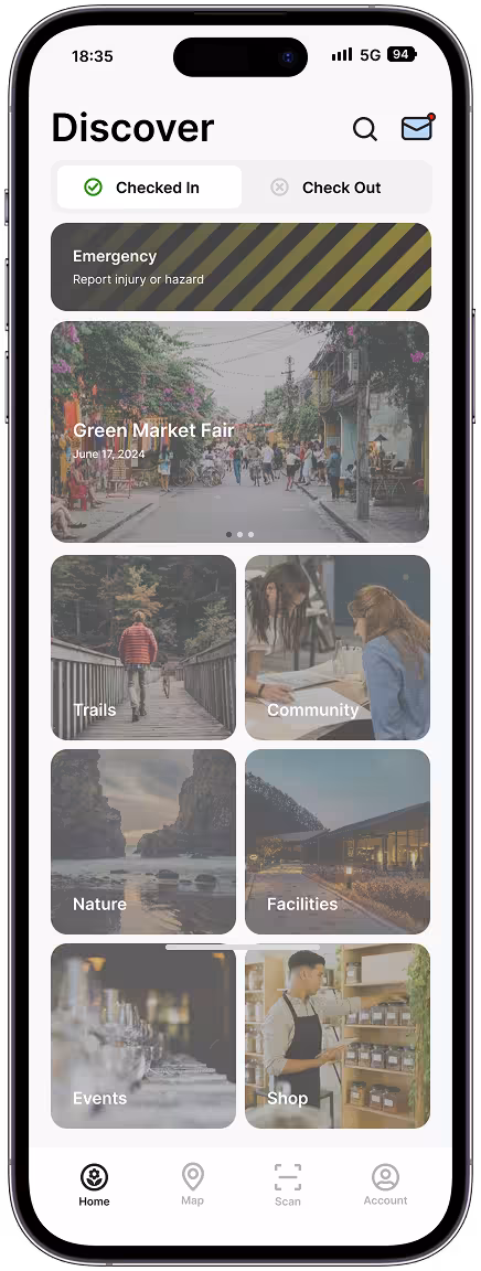
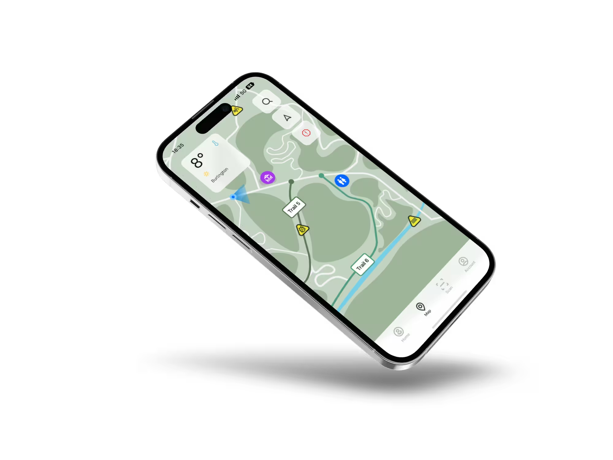
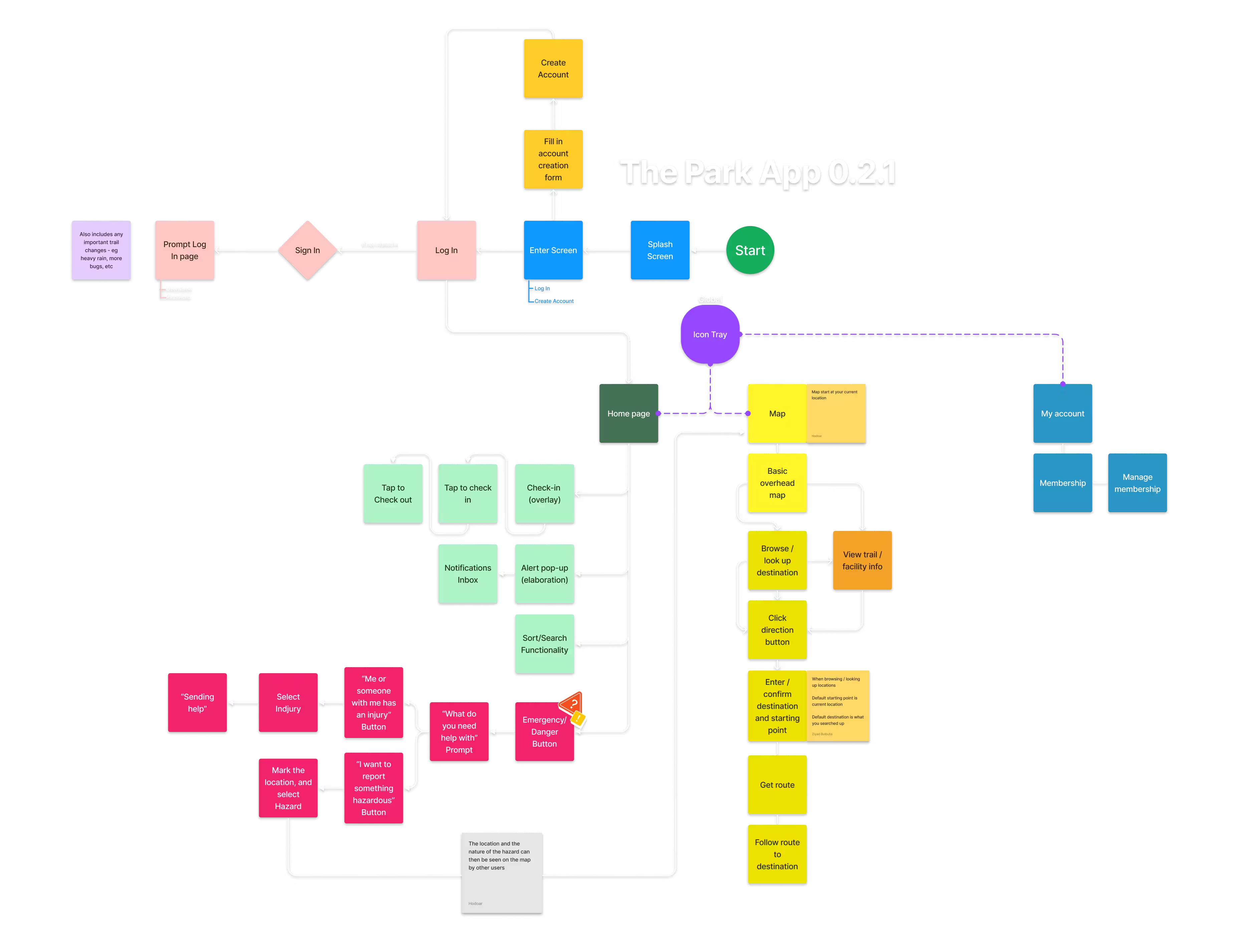
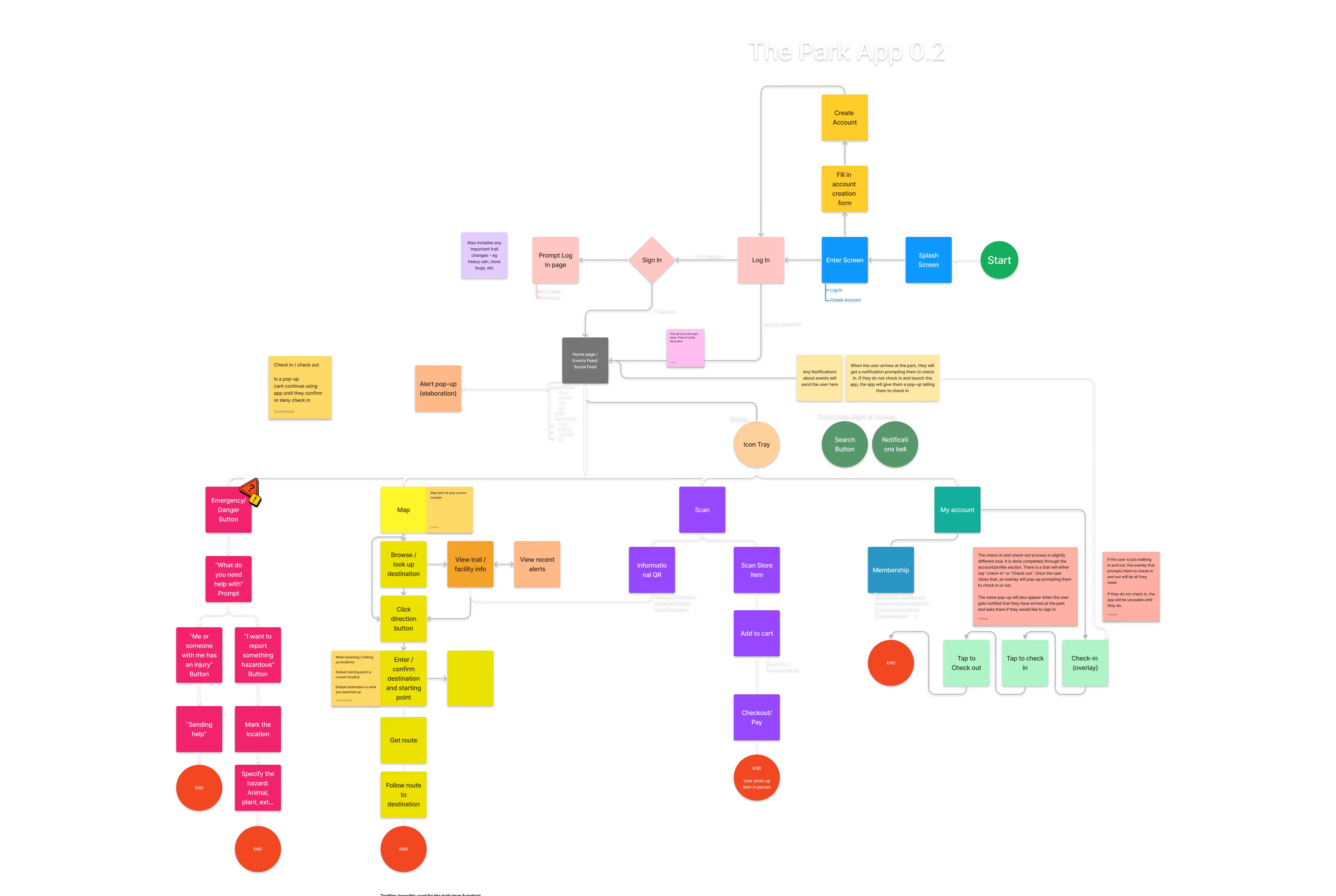
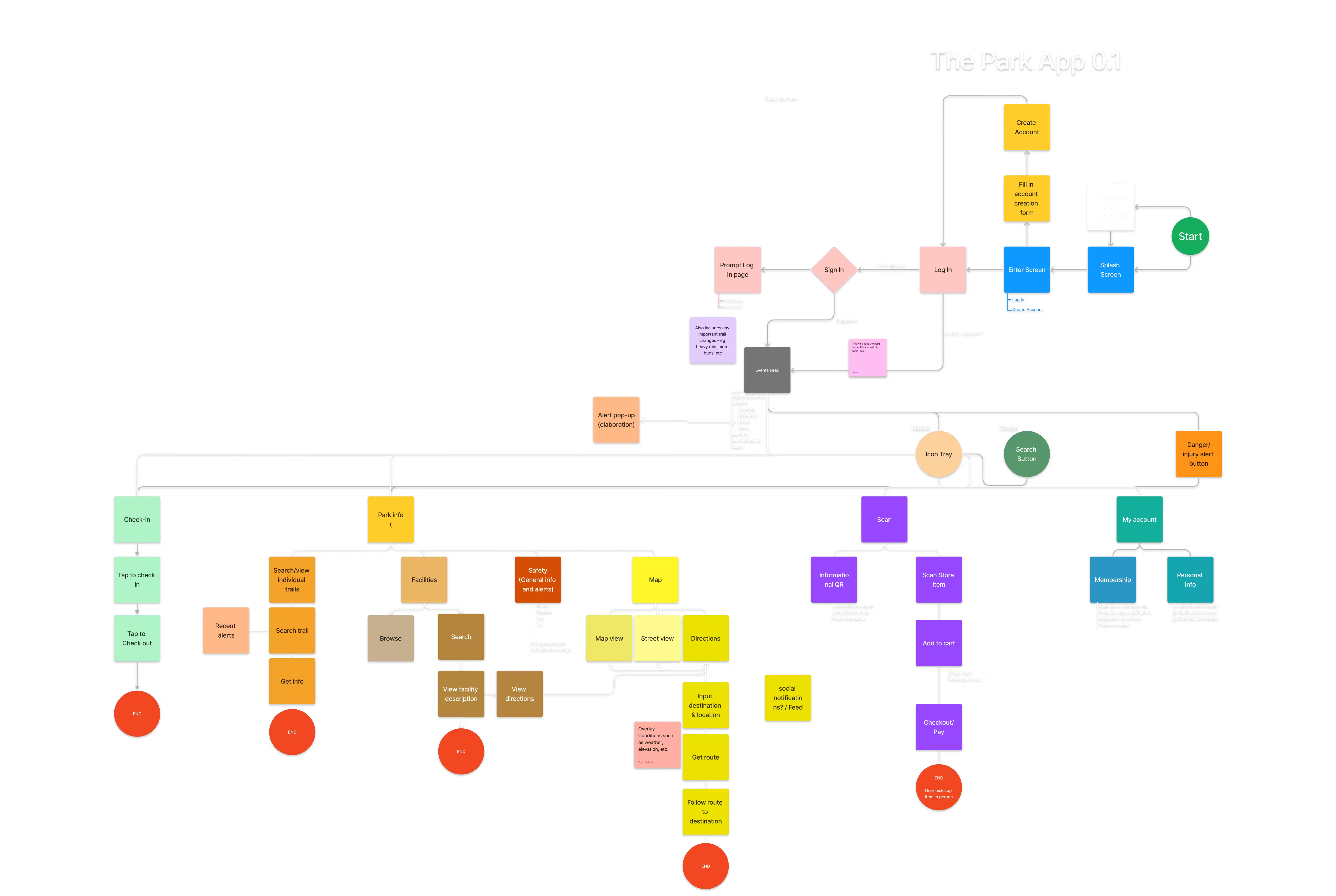
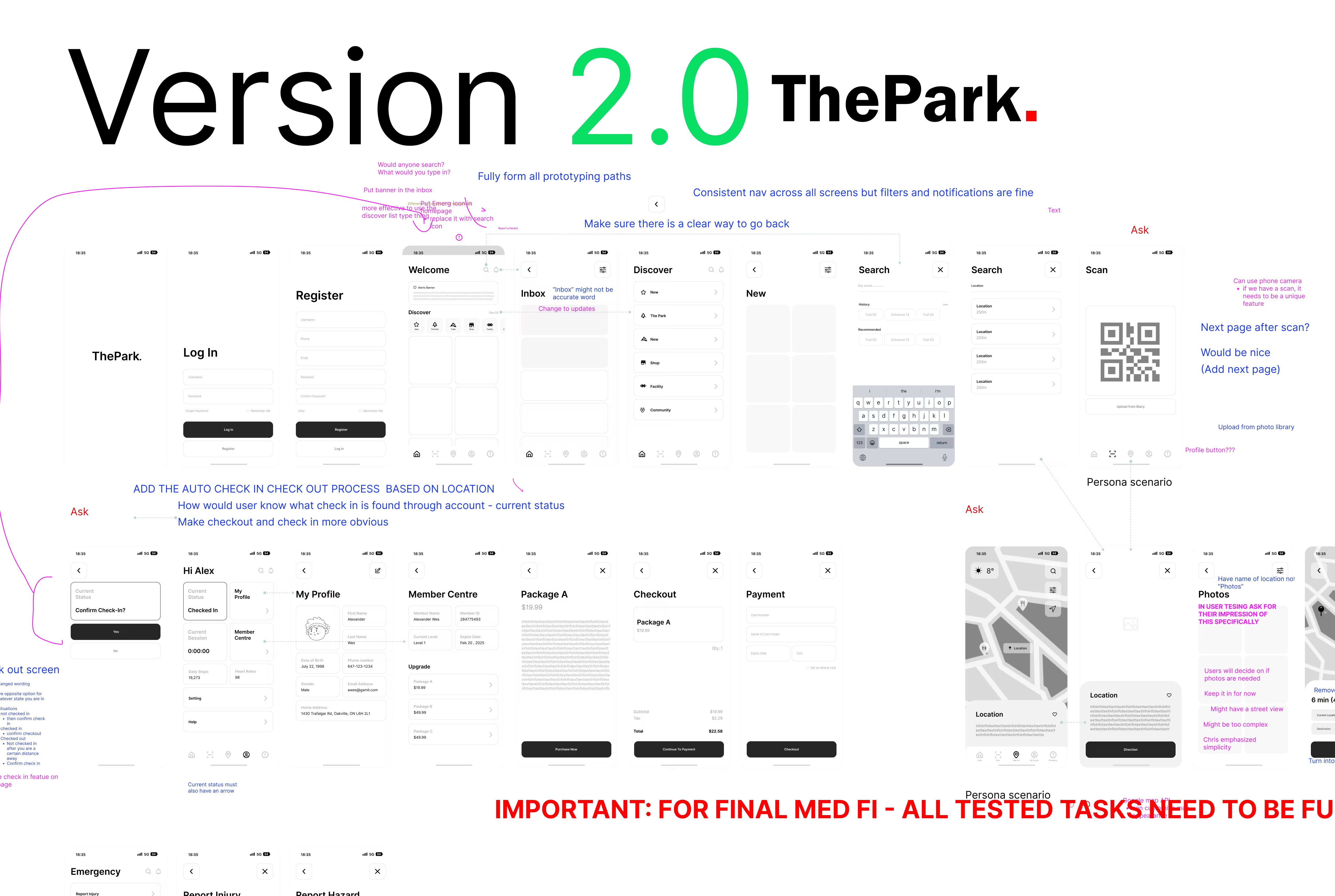
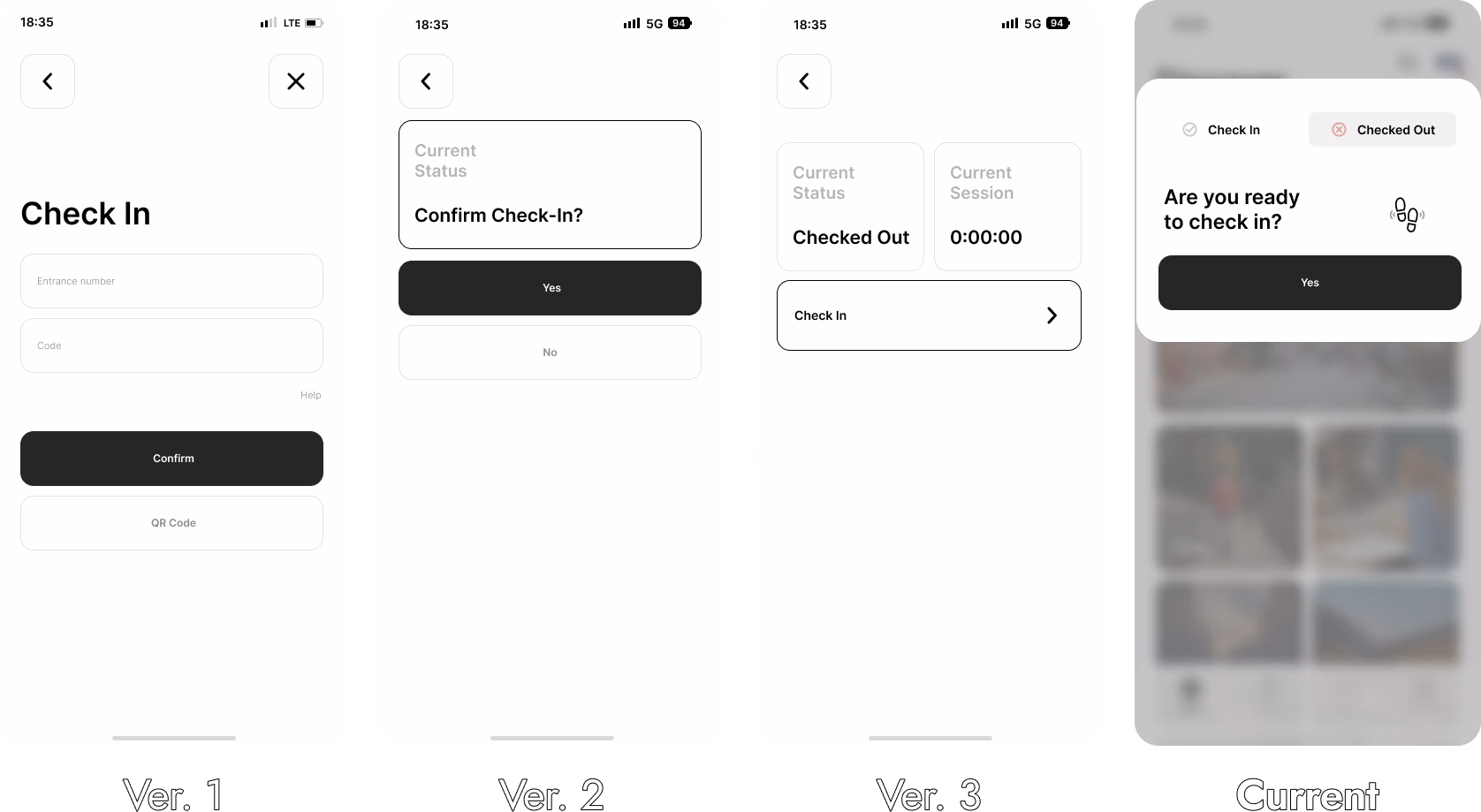
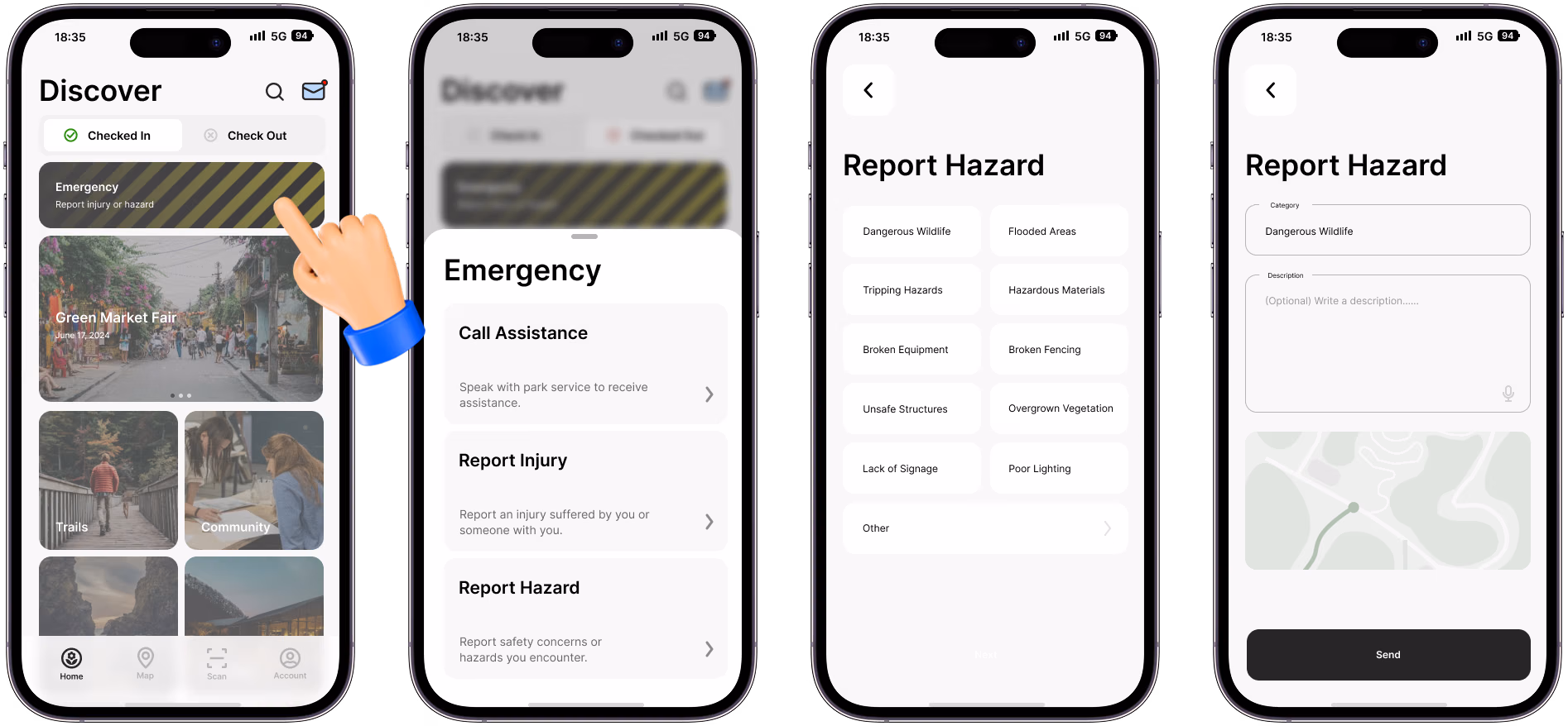
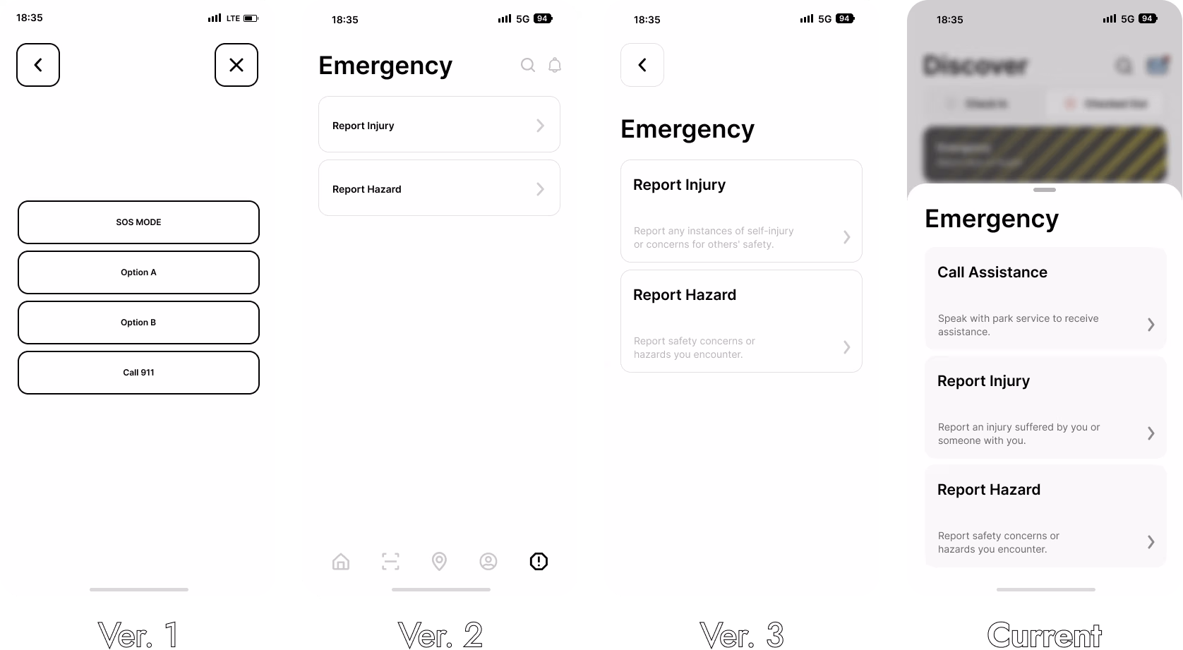
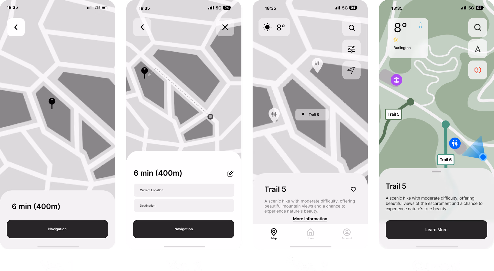
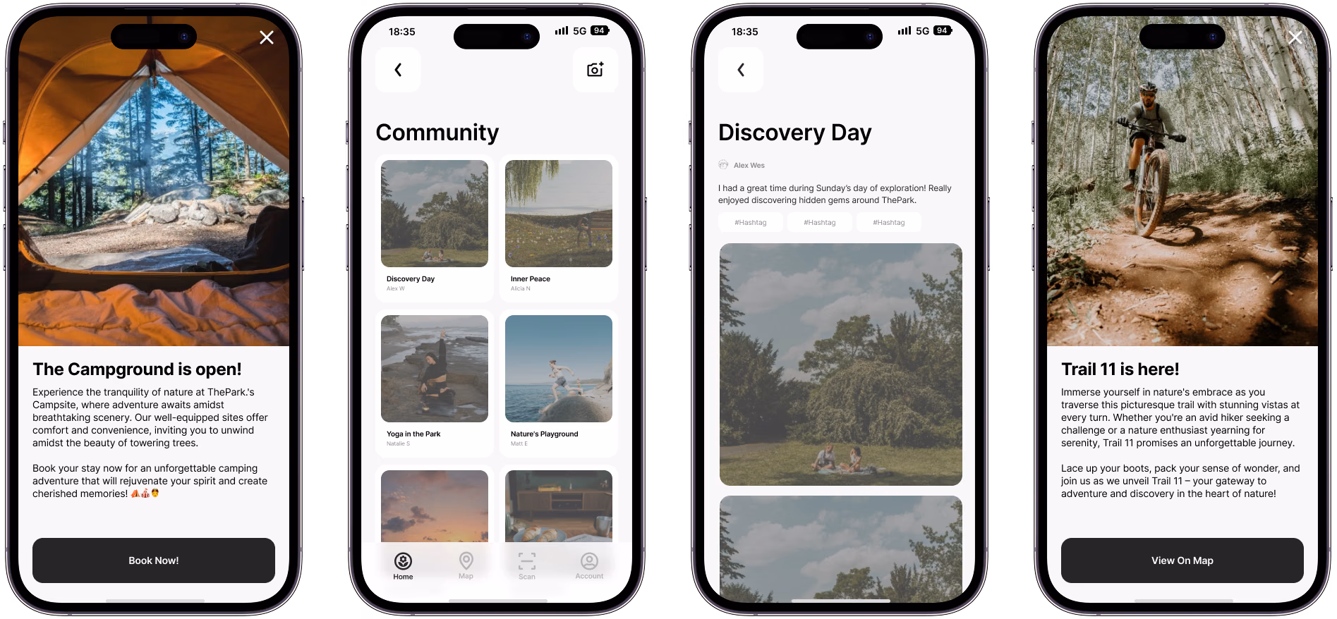

Graphic Designer
User Researcher & Interviewer
Ziyad Bulbulia
Qing (Rachel) Su
Elizabeth Silva
Vraj Sureshbhai Dudhatra
Illustrator
Photoshop
Mural
Interviews
Surveys
Usertesting.com
How can we integrate a digital product into an outdoor park?
Working with Chris Greenfield, our team developed a prototype for his latest venture: ThePark.


How can we effectively integrate a digital product with a suite of features into a private outdoor adventure park?
Our project involved developing a prototype for a digital experience for Chris Greenfield's private members-only outdoor adventure park, “ThePark”. This product needed to incorporate features such as park maps, safety measures, community engagement, and more.
This project forced our team to explore the world of outdoor trails and activities. Chris Greenfield, our project partner, outlined his basic wish list of features for whatever digital solution we came up with, but it was up to our team to develop & execute a research plan
Chris Greenfield is a technology entrepreneur with over two decades of industry expertise. Chris is also the founder of TipTap, an innovative digital fundraising and payment platform tailored for charitable organizations and non-profits.

Our team consisted of five members:
(Me) Daniel Lionti - Lead Designer
Ziyad Bulbulia - Facilitator & Customer Rep
Elizabeth Silva - Notes & Customer Rep
Qing (Rachel) Su - Designer
Vraj Sureshbhai Dudhatra - Designer
Our roles were dynamic and adapted to the project's needs. It was crucial for everyone to engage in various aspects of the project to gain a comprehensive understanding of the goals and solutions. As the lead decision-maker, I prioritized open communication within the team to ensure all ideas and concerns were addressed.

Based off our conversations with Chris, our project had three main goals:
Address any challenges faced by users while navigating ThePark.’s amenities and trails.
Promote safety and enjoyment during park visits.
Contribute to the park’s reputation as a premier destination for outdoor recreation.
Chris wanted our team to concentrate on the initial phase of ThePark's development, which emphasizes attracting visitors to the park. This phase includes outdoor activities, trails, shops, and other attractions designed for outdoor enthusiasts. The prototype's features needed to align with these objectives.
Future updates could expand the app to include features for camping, events, biking, ext..., broadening its appeal to a wider audience.
Our research would focus on the best ways to implement the requirements set out by Chris in his brief to us, as well as address any issues found during our research & discovery phase. Our focus was on figuring out what problems park-goers faced, and what sort of digital solution would best address their problems.


Our research was structured into a few phases.
Initially, we crafted a research plan to identify our target audience and establish the questions and goals we needed to address. During this process, Chris invited us to visit the future site of ThePark, which provided valuable insights into how the park might be utilized by visitors. The next phase involved conducting interviews with individuals familiar with parks, trails, biking, hiking, and other outdoor activities.
Additionally, during development of the prototype, we conducted three rounds of user testing. These tests, and the changes implimented based on participant feedback, are detailed throughout the 'App Overview' section.
Our team developed three personas, each reflecting one of our project goals.
Before conducting our interviews, our team visited the future site of ThePark. As we were not familiar with outdoor experiences and trails, we believed a site visit would help us better understand the activities visitors might engage in.
Our team decided that conducting interviews would be the most effective way to understand our users, directly address any questions we had, and gather data to inform our design decisions. We interviewed a diverse group of outdoor enthusiasts, each familiar with activities such as parks, trails, biking, hiking, and camping. We also sought individuals who were experienced with existing apps like Google/Apple Maps and AllTrails.
These are actual pages of our research plan, along with photos of the future sight of ThePark taken during our site visit.


After completing our interviews, we organized and analyzed the data gathered from participants.
Our team used affinity mapping to categorize and analyze the data, allowing us to identify patterns with responses. We organized key statements into several categories, with the most significant being:
Gathering Information - This category focused on how participants gather information about park events & activities, decide on visiting a park, locate maps, and engage in other information-gathering activities.
Safety Concerns - What conditions and resources contribute to participants feeling safe or unsafe.
Apps - What features make park apps valuable or ineffective? Participants shared their thoughts on what they would modify or add to enhance these apps.
Other categories included Memberships, Booking, & Activities.
By analyzing the affinity map, we identified several key insights that guided our prototype design:
The static presentation of physical maps makes it difficult for users to follow directions accurately.
Visitors are eager for up-to-date information about their surroundings, including weather conditions, available activities, and unique details that are especially useful for first-time visitors, such as the presence of wildlife or insects.
Visitors are eager to have a feature that allows them to report hazards or injuries, ensuring that park authorities are promptly notified of any safety issues.
Based on our key insights and prototype requirements, we crafted three need statements that represent potential visitors to ThePark. These statements served as guiding principles during the prototype design process.
"As a user seeking navigation assistance, I require dynamic mapping solutions that adapt to real-time changes, as static physical maps often hinder my ability to accurately follow directions, ensuring a smoother and more reliable navigation experience."
"As a visitor exploring a new environments, I require access to real-time information on weather conditions, available activities, and even details like wildlife populations, to make informed decisions and enhance my overall experience."
"As a park visitor concerned about safety, I need to be able to report hazards or injuries within the app, ensuring prompt notification to park members and authorities to help ensure a safer environment for all visitors."

Our research, interviews, site visit, and data analysis indicated that an app would be the most effective way to meet ThePark's requirements.
By this stage in our project, our team was confident that developing an app prototype for ThePark would be the most effective solution. An app provides a straightforward way to access and manage the extensive features required, quickly addressing any user needs durring their stay at ThePark.
Other product ideas were explored, but an app would provide the most straightforward approach. And with safety as a big priority, it was important for any individual to be able to easily and quickly access information and resources that something like ThePark App could provide.
As ThePark continues to grow and evolve, an app offers the flexibility we would need to integrate new features and services.

During our design phase, we created multiple iterations of an app flow chart to help organize how the app's features should be put together. Before developing any low-fidelity mockups, it was essential to identify all desired features and organize them effectively within the app.
This flow was always being refined based on feedback and suggestions throughout the design phase.
Our team dedicated several weeks to designing Figma mockups at various fidelity levels. After each design phase, we held meetings with Chris to discuss the project's progress. During the final high-fidelity design stage, we launched an early prototype of ThePark App on usertesting.com to gather real-world feedback. Adjustments based on user testing and other feedback will be detailed in the 'App Overview' section.
This prototype was a significant undertaking for our team, but we are all pleased with the final outcome.
The app flow went through a few different revisions, mainly changing how users would access the check-in/out and map/navigation. This was the final layout, and by far the least convoluted one.
ThePark's App was designed with 5 main features:
A system to handle cheking-in/out
Safety & Reporting
A detailed map & navigational system
A scanning system to handle payments and information
A community section for sharing photos and other posts
Other smaller features we designed include Onboarding, News Alerts, & Account management.


Our user onboarding process has three objectives: get users to create an account, set up their payment information, and familiarize them with the app's basic features.
Given the many features of ThePark App, we found it beneficial to provide users with a brief introduction to the app's functionality and capabilities. It was also essential for users to set up their accounts and payment information to facilitate membership payments, access all app features, and properly visit ThePark's physical location.
During our final round of testing, testers indicated that they found the brief introduction to the app benificial.

One of the main features of ThePark App allows visitors to check in upon arrival. The check-in/out toggle is conveniently located on the main menu screen for easy access. This feature tracks the duration of a visitor's stay and monitors their location to ensure safety. In the event of an emergency, such as a visitor not moving for an extended period, park staff will be alerted, and a ranger can be dispatched to assist. Once a visitor is ready to leave, they can check out using the app, notifying staff that they have exited the park safely.
Once the visitor is ready to leave, they can use the app to check out. This action will notify staff that the visitor has exited the park safely. If the user leaves the park without checking out, the app will send periodic reminders until they complete the check-out process.
-Statement from user testing participant
Initially, the Check-In/Out feature was located within the account section rather than on the homepage. Users thought that this was unintuitive.
Following feedback, we incorporated the Check In/Out feature onto the homepage.
We also modified the format and wording of the buttons due to participant confusion.
Our team considered implementing automatic check-in and check-out features. However, we decided against it to prevent accidental check-outs for those who might leave the park briefly, such as to the parking lot, and to avoid checking in individuals who are merely passing by.


In addition to the check-in/out system, ThePark App includes a crucial safety feature: Hazard/Accident Reporting.
In the main menu, near the top of the screen, there is an emergency button. This feature allows users to report any hazard or emergency situation. Users can select whether they are reporting an injury or a hazard and then fill out a short form. Alternatively, users have the option to call for assistance, connecting them directly to a park ranger to resolve any issues over the phone.
If a user reports a hazard, such as spotting a hornet's nest or a coyote, a marker will be added to the map for other users to see, and a park ranger will be dispatched to investigate.
Initially, the Emergency feature was placed within the account section, which was not easily accessible. Based on user feedback, we moved this feature to the homepage for better visibility.
Users were required to type a description of the issue after selecting a hazard or injury. However, feedback revealed that users might not always have the time or ability to type a response. As a result, we implemented pre-filled options that users can select based on their issue.
Additionally, during user testing, several participants expressed that they wanted an option to call for assistance. In response, we implemented a call feature, enabling users to directly connect with the park team for immediate support.
Once you’ve added a brief description and confirmed your location, you tap “Send”. The app then prompts you to confirm your decision, and once confirmed, you are sent to the confirmation screen.


Visitors at ThePark can use their phones to make purchases at self-serve kiosks offering drinks, snacks, charging stations, and more. By scanning a QR code on the desired product, the app processes the payment, eliminating the need for cash or cards.
This feature also allows users to scan QR codes at various points of interest throughout ThePark. By scanning these codes, users can access detailed information about each location, enhancing their visit with educational content.
Purchases at ThePark are facilitated through a scanning system, a feature that our team and Chris meticulously developed. Chris, being an active individual, understands the convenience of not having to carry a wallet while engaging in activities like biking or jogging.

The app is designed to foster a community among park visitors. Users can share photos of their experiences at the park through the app's community features, which are displayed in the Community Feed for everyone to view and comment on.
ThePark members will also receive timely alerts about events, new trails, and facilities. Whenever there's an update, a popup notification in the app ensures everyone is informed about the latest happenings at ThePark.

The current prototype was designed with ThePark’s Phase 1 development in mind, focusing on 'Play' to attract outdoor adventure seekers. As the app evolves and integrates with ThePark, it will be crucial to consider future phases to develop and refine new features.
For instance, Phase 2 emphasizes 'Work,' which involves gathering artisans and craftspeople to conduct classes, set up workshops, create a marketplace, and build social programs for the community. The app will need to adapt to accommodate these new activities, which may necessitate designing entirely new sections of the app.

This project was a significant learning experience for me, as it was my first time developing a prototype of this scale. We prioritized equal input from all team members, regardless of their roles or experience.
As the planner, I focused on incorporating everyone's feedback into our strategy. Ensuring team satisfaction with their tasks was crucial, so we held regular meetings to discuss project development. Our flexible roles allowed us to adapt to the project's needs without any issues.
I'm really glad that I got to work on so many different aspects of the project. It gave me a really good understanding about what we were designing and who we were designing for, which was valuable during presentations, critiques, and when I had to format everything for this webpage.
Our team was encouraged to develop a team name and a logo that could be used on the cover page of our presentations.
This was a fun low-stakes teambuilding exercise that we all really enjoyed. But as it turned out, none of us could come up with a very good team name. Thankfully, the internet is full of many things. One of those things being a random word generator, so using that, we were able to come up with ‘EcoVoid’. One of our professors said that it sounded like a metal band, so using that as my inspiration, I designed the most metal logo I could come up with.
Our team had a blast with the whole thing.

Our team ensured that all research activities adhered to ethical standards, with each member being TCPS 2 certified. We followed proper practices and guidelines throughout the research process. All collected data was securely stored on a password-protected remote server, accessible only to our team. The anonymity of research participants and user testers is strictly maintained, ensuring their privacy is protected.
The majority of the prototype design was executed in Figma, with a small portion completed in Illustrator. The working prototype is in Figma. Most icons were sourced from Google's icon library, though some, like the custom home button, were designed by me.
We developed a comprehensive component library for the project, which significantly accelerated the development process. However, due to time constraints and the unique nature of certain app features, many elements had to be designed on the fly. Additionally, I created a straightforward library for typography and color schemes.
We ensured that all aspects of the project met AA or AAA accessibility standards. Layouts were thoroughly reviewed and adjusted as needed to improve accessibility.
