

UI Designer
Illustrator
Photoshop
InDesign
Webflow

Giving RBC a new look.
This case study explored enhancing RBC's brand identity by modernizing their visual elements.


This case study examined ways to enhance RBC's brand identity by updating their visual elements. The process included researching the company's history, creating a new logo, revising the brand standards guide, and developing high-fidelity app and webpage mockups, along with a mockup for an annual report.
Royal Bank of Canada is a Canadian multinational financial services company and the largest bank in Canada by market capitalization. The bank serves over 20 million clients and has more than 100,000 employees worldwide.
Develop comprehensive mockups illustrating a refreshed RBC brand identity. Demonstrate how this updated identity can be applied across various media platforms, including both print and digital formats.


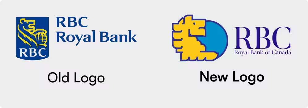
Preserving the historical significance of RBC's older logos was crucial, so I opted to modernize the existing lion and globe design rather than create an entirely new logo. This approach respects the brand's legacy while updating its appearance for a contemporary audience.
When designing the new logo, I aimed to modernize the lion design while retaining its historical significance. I also updated the wordmark to a more refined style, as the previous one seemed dated. Additionally, I created several logo variations to suit different applications, all detailed in the brand standards guide.
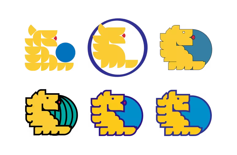
Multiple logo versions were crafted to accommodate various applications. For instance, a text-free version is used when the logo needs to be displayed in a smaller size, as detailed in the brand standards guide.

.avif)


Extensive development was involved in crafting the final logo, with numerous iterations in color schemes, sizes, and typography.


As part of the project, I developed a comprehensive brand standards guide. This was not only essential for RBC but also served as a valuable tool during the project's later stages.
The guide includes logo use cases for business cards, letterheads, envelopes, websites, apps, and more. Additionally, it contains sections that instruct users not to stretch, recolor, or otherwise alter the logos in any way.
A sample of a few pages from the new RBC brand standards guide


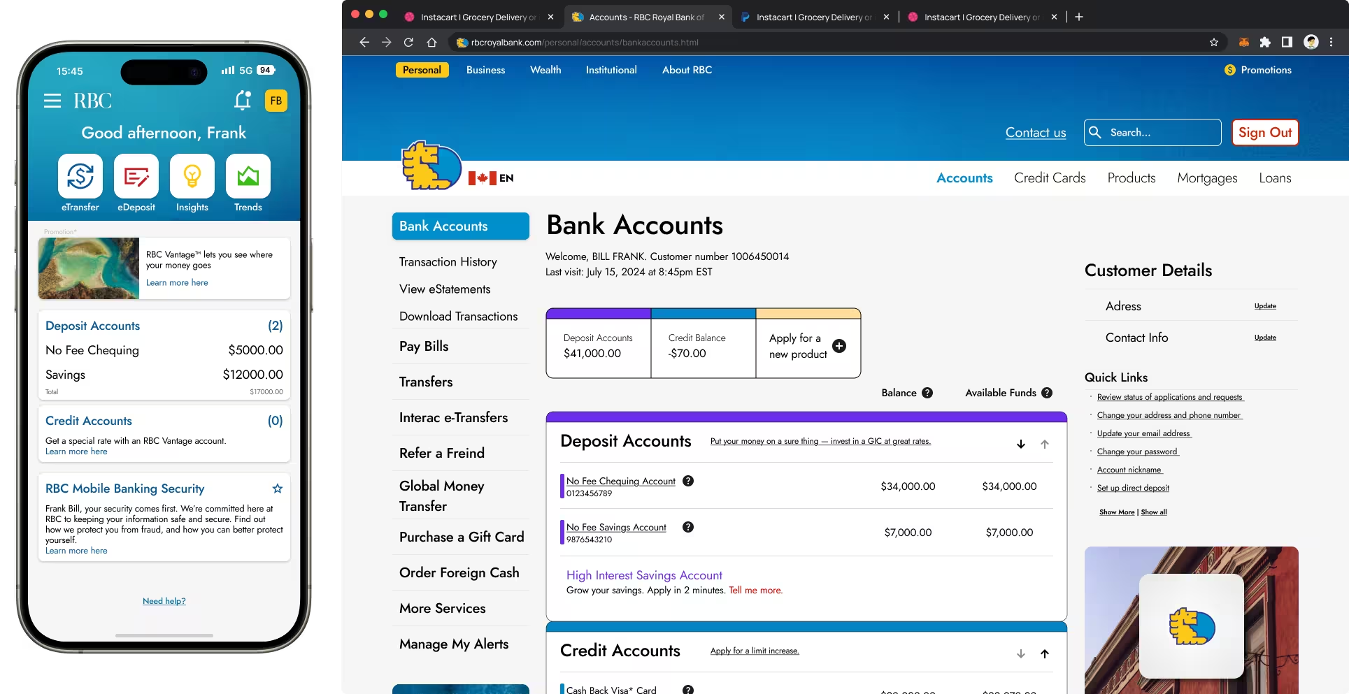
These are some mockups that showcase how RBC’s new design could be applied to their existing website.
This redesign focused primarily on visual updates, ensuring the user experience remained consistent with the original website. That being said, AAA compliance and basic UI/UX principles were adhearded to for the website and app.


These are some mockups that showcase how RBC’s new design could look when applied to their app.
Similar to the website redesign, this update primarily focuses on visual enhancements without significantly altering the user experience. However, fundamental UI/UX principles were applied, potentially improving the app's functionality.
This mockup includes a homepage, as well as pages for accounts, support, promotions, product offerings, and more.


Here are a few pages from a mockup RBC annual report, redesigned in accordance with the updated brand standards guide developed earlier in the project.
This mockup includes sections for promotional content as well as detailed pages for data and statistics.


I learned a lot about creating and working with a brand identity in this project. Creating a new identity for RBC that acknowledged all of the company’s history was an interesting challenge, and navigating that challenge taught me a lot about how to work with established brand identities.
As with any project, there are always areas for improvement. It can be challenging to determine when to stop refining a project, but I'm satisfied with the outcome. There's always room for future enhancements.


